Take the headache out of online shopping
Founded in 1991, Canada Computers & Electronics is a retailer of computers, IT and components. Over its 25 year history, they continue to provide customers with the best products at the best value that the computer retail world can offer.
Role
Role: Graphic Designer, UX & UI Design
Methods and Tools: Surveys, Sketches, Photoshop
Practices: User Research, Prototyping
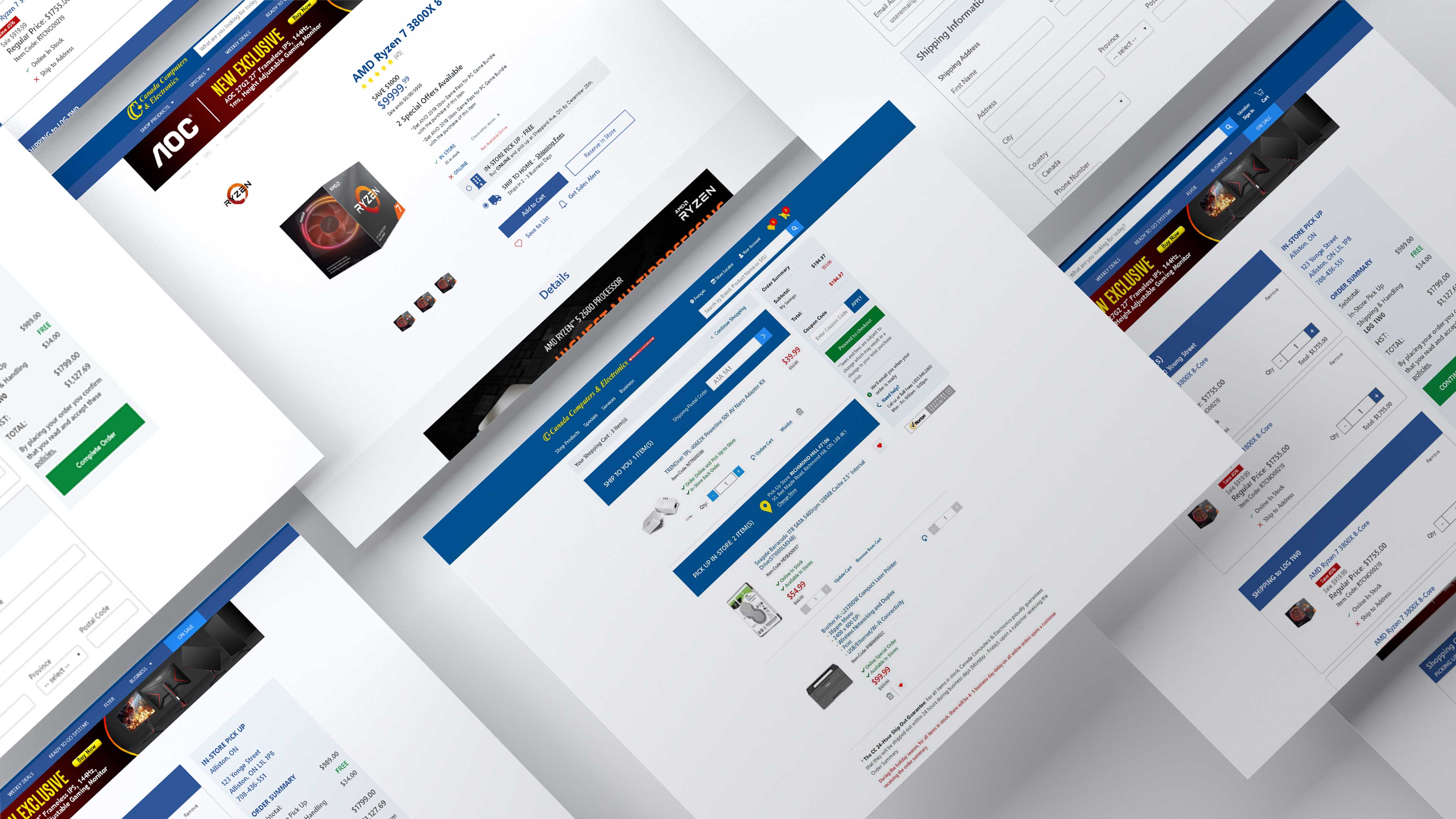
The checkout process of the site needed to be reworked. We had to create new processes that made purchasing products easier for new and regular users alike.
Note: For this case study, I will be addressing the issues faced by the users and the features we wanted to roll out to help facilitate the checkout process.
The Problems
We wanted to focus on the sites low conversion rates. We noticed we were getting a lot of visitors, but not many were completing their checkouts.
Some of the issues that we suspected led to this worrying trend were:
- High user drop off rate: From the cart page to the shipping page there was a 43% user drop off rate and from the shipping page to the payment page a 36% dropoff. This led to low conversion rates caused mostly by the lengthy account creation process, even as a guest.
- Concerns regarding payment security: There weren’t any visual cues to address how secure the payment of the website was to ensure that the customer's money is safe and is sent through a secure payment gateway.
- Blocking orders from mixed status items: Users wanted a way to check out when orders included delivery items, open box, refurbished or ship to store items.
Goals
Having a working prototype with the new features would be the first measure of success in this ongoing process.
To fully measure if we solved the identified pain points and improved the overall checkout experience, I advised that the following Key Performance Indicators (KPI) be measured:
- Shopping cart and Checkout abandonment rate
- Sales conversion rates
- New customer orders vs. returning customer orders
Demographic
The vast majority of users were younger males building their first computer to seasoned veterans upgrading their existing systems with lots of disposable income.
A small minority were non tech saavy family members who were gift shopping but were just off by the convoluted shopping experience. This showed us that we had to make our site a lot more accessible.
But for the most part, they are:
- Tech saavy
- Regular in-store shoppers
- A growing mobile demographic
Defining the process
We broke the project down into the four key steps:
- User research
- Design
- Testing
- Implementation
Once we had a timeline to produce a Minimum Viable Product (MVP), working with an agile, sprint-based process allowed me to iterate on and validate potential solutions early and often.
Discovery & Analysis
Some steps I took to learn more about who I was designing for were:
- I started off by doing an analysis of all the pain points that the user encountered to complete a checkout.
- I did some competitive analysis to understand the common trends and industry standards of a fast checkout experience.
- Conducted multiple interview sessions with stakeholders understood the problems users were facing with the current checkout process.
- I travelled to some stores to talk with employees and customers looking to make purchases.
- 72% (out of 100 participants) agreed that the site was mostly used for comparison shopping or simply just browsing new products.
Journey mapping
The journey maps helped determine screen to screen user interactions. They also helped me consider the structure and layout that would be necessary for specific screens.
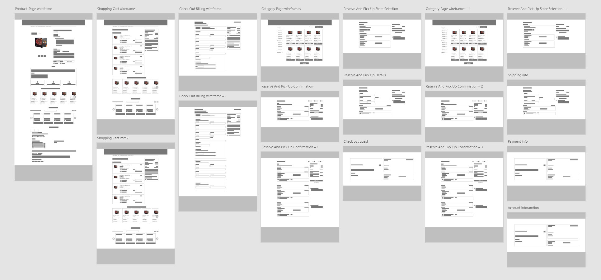
Sketching & Wireframing
Once I had a creative brief and a list of features we wanted to roll out, I went into wireframing. I tried to iron out details of the experience and find any additional pain points that may not have come up during initial planning.
The Solutions
End results
When we analysed the statistics and general customer satisfaction of some of the new changes, we realized the following:
- We did a quick one month closed test realized that conversions went up 9%.
- Revenue on the site was up 13%.
- Following up with users previously interviewed showed a great improvement in users trust factor.
Design implementations
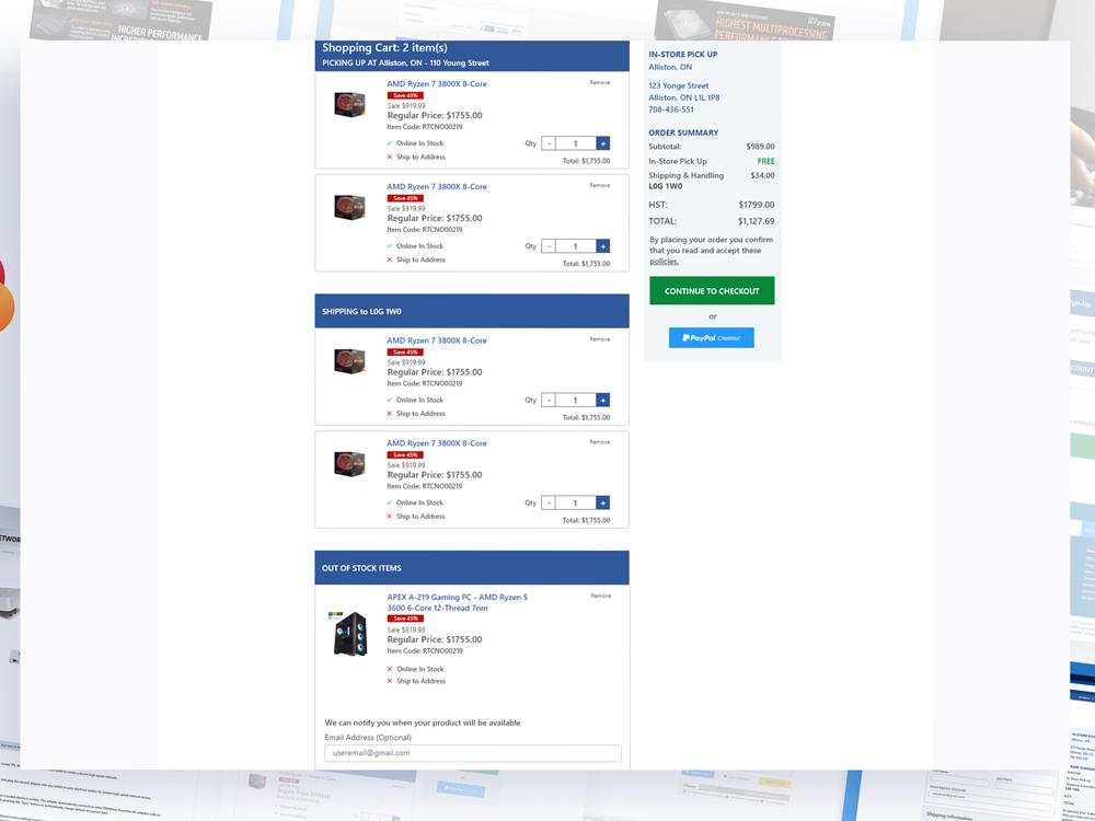
Allowing the user to checkout with a mixed cart.
We now had a way to enable users to successfully add pick-up in store items and delivery items to their cart. They could even purchase or wishlist backorder items and we’d simply notify them via email when the item is ready to be shipped.
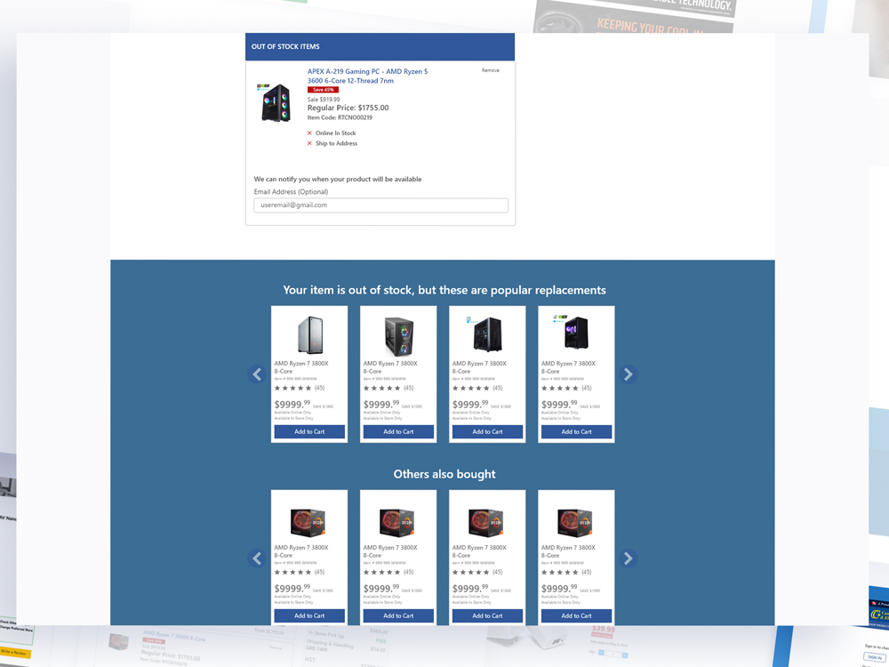
Suggested items and cross sells
We wanted to give users the option to replace any items that are out of stock with similar items right below the purchase section. Adding the “Others also bought” section to help with cross sells was a feature that was in high demand and is a standard in most e-commerce sites.
Quicker check out process
We consolidated the checkout process by simplifying the Guest checkout. It would take you directly to the payment screen where you would just have to add in your name and shipping address.
Lower down you can enter all your information, but we kept it short to only the most basic of information. The store you are picking up at is displayed to the right, and if any items are being shipped shipped we would include shipping information. Completing the order takes you to the confirmation screen where an email is sent to you . Trust badges are added to single out the the credit card section to help focus on that stage of the transaction and build confidence with the user.
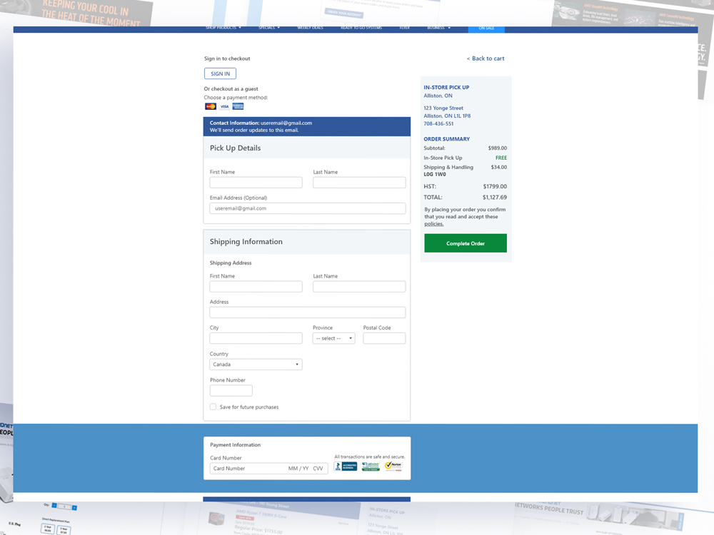
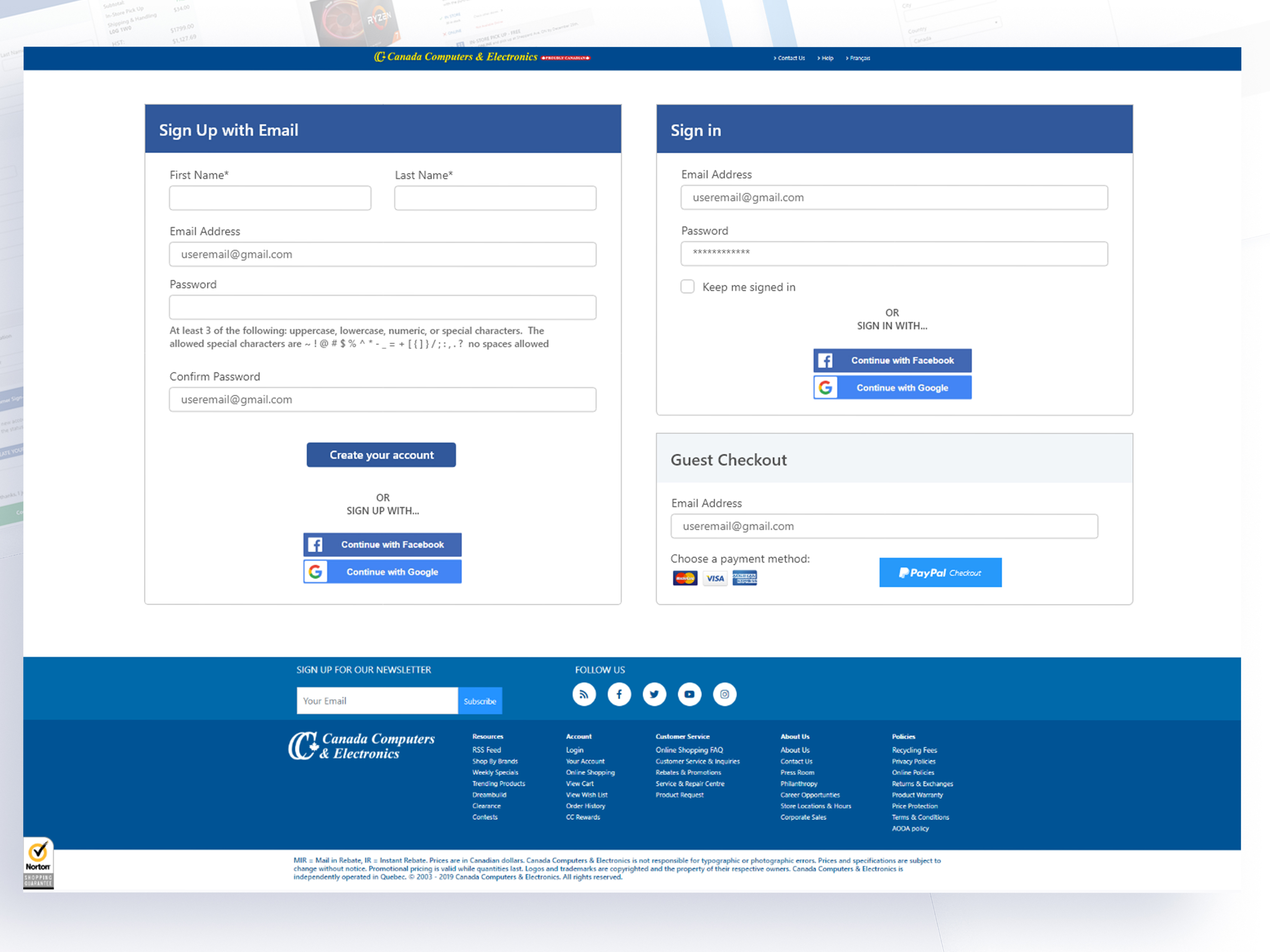
Guest checkout
And as we introduced an easier way for guests to check out we reduced abandonment, made it easier for mobile users to check out by taking them straight to payment options. And of course, we give them the option to register an account upon checkout.
Conclusion
What limitations did I have to work with?
The big challenge with this project was scope creep and managing development time. The more pain points we found the more features we wanted to implement. So it was about managing expectations to have a product we could deliver on time.
Working closely with the devs I was able to identify and then work around technology, budget and manpower limitations and develop a solution that was streamlined and solved our problems.
Lessons learned:
I learned that the initial research, determining the target audience then tailoring the experience to that demographic was key. We had a slew of features that we wanted to roll out but had to hold back as they would most likely cause a drop off of usage in the website.
Contact Me
Let’s connect and talk about what I can do for you. Email me at petersonpatrickjoseph@gmail.com.
Download my resumé for more detailed version of my work history.